Matplotlib
Matplotlib permet crear tot tipus de gràfics en Python: línies, barres, pastís, dispersió, histogrames i més. Primer generes les dades (normalment amb NumPy), després “construeixes” el gràfic afegint elements com etiquetes, títols, llegendes i quadrícules. Finalment, plt.show() el mostra. Cada comanda que dibuixa dades afegeix un nou element visual, i pots personalitzar-los amb colors, tipus de línia, formes i altres estils. També és possible crear diverses figures i subplots per mostrar diferents gràfics dins del mateix espai, cosa que facilita comparar dades i visualitzacions.
Basics: Common Plot Types
Visualize data using line plots, scatter plots, histograms, bar charts, and pie charts.
import numpy as np
import matplotlib.pyplot as plt
np.random.seed(3)
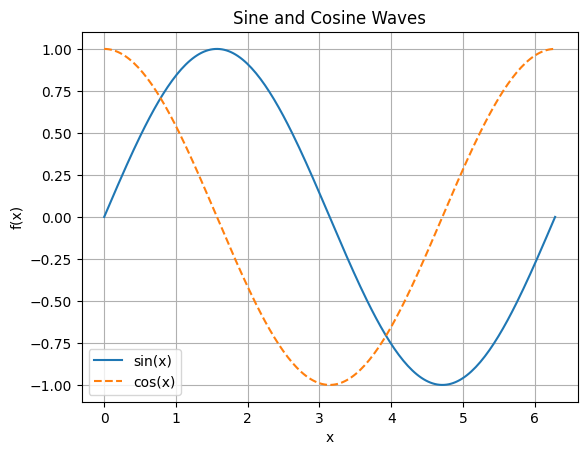
Line Plot
- Use
plt.plot()for continuous data. - Add labels, title, grid, and legend.
x = np.linspace(0, 2 * np.pi, 200)
y1 = np.sin(x)
y2 = np.cos(x)

plt.plot(x, y1, label='sin(x)')
plt.plot(x, y2, label='cos(x)', linestyle='--')
plt.xlabel('x')
plt.ylabel('f(x)')
plt.title('Sine and Cosine Waves')
plt.legend()
plt.grid(True)
plt.show()
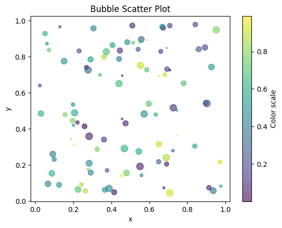
Scatter Plot
plt.scatter()for showing individual data points.- Color and size can represent additional dimensions.
x = np.random.rand(100)
y = np.random.rand(100)
colors = np.random.rand(100)
sizes = 100 * np.random.rand(100)

plt.scatter(x, y, c=colors, s=sizes, alpha=0.6, cmap='viridis')
plt.colorbar(label='Color scale')
plt.title('Bubble Scatter Plot')
plt.xlabel('x')
plt.ylabel('y')
plt.show()
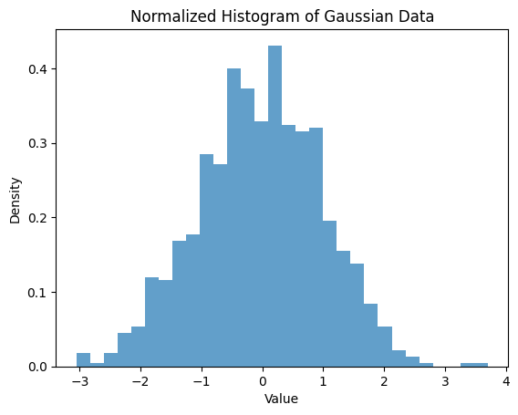
Histogram
plt.hist()to visualize distributions.- Adjust bins and density.
data = np.random.randn(1000)
plt.hist(data, bins=30, density=True, alpha=0.7)
plt.title('Normalized Histogram of Gaussian Data')
plt.xlabel('Value')
plt.ylabel('Density')
plt.show()
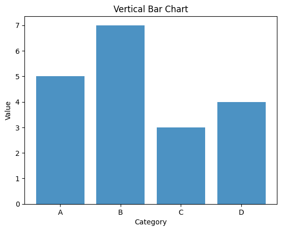
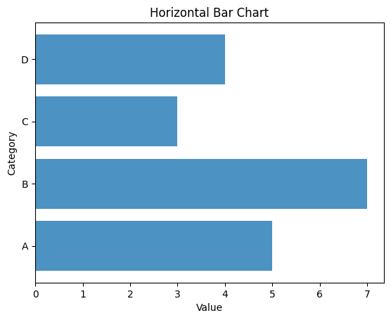
Bar Chart
plt.bar()for categorical comparisons.- Horizontal bar:
plt.barh()
categories = ['A', 'B', 'C', 'D']
values = [5, 7, 3, 4]

plt.bar(categories, values, alpha=0.8)
plt.title('Vertical Bar Chart')
plt.xlabel('Category')
plt.ylabel('Value')
plt.show()

# Horizontal bar chart
plt.barh(categories, values, alpha=0.8)
plt.title('Horizontal Bar Chart')
plt.xlabel('Value')
plt.ylabel('Category')
plt.show()
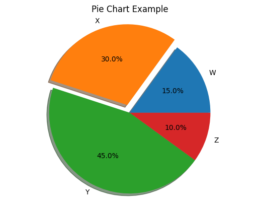
Pie Chart
plt.pie()for composition of a whole.
labels = ['W', 'X', 'Y', 'Z']
sizes = [15, 30, 45, 10]
explode = (0, 0.1, 0, 0)  # only 'explode' the 2nd slice

plt.pie(sizes, labels=labels, autopct='%1.1f%%', explode=explode, shadow=True)
plt.title('Pie Chart Example')
plt.axis('equal')  # Equal aspect ensures pie is drawn as a circle.
plt.show()
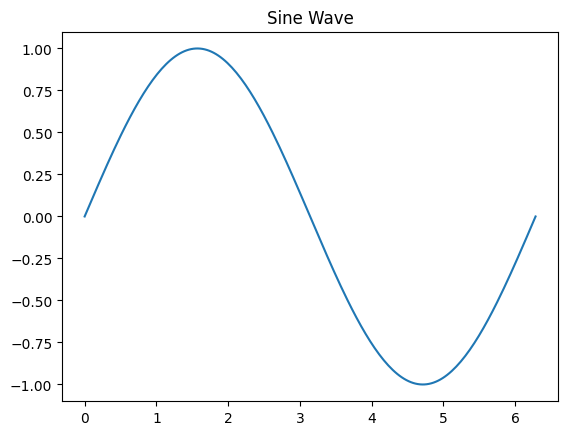
Saving Figures
- Use
plt.savefig()to export plots.
# Example: Save the sine wave plot
x = np.linspace(0, 2 * np.pi, 200)  # Redefine x for the sine wave
y1 = np.sin(x)  # Redefine y1 based on the correct x

plt.figure()
plt.plot(x, y1)
plt.title('Sine Wave')
plt.savefig('data/sine_wave.png', dpi=150)
print('Saved figure as sine_wave.png')
Saved figure as sine_wave.png
Subplots & Advanced Plots
Learn to create complex layouts and advanced visualizations such as error bars and images.
import numpy as np
import matplotlib.pyplot as plt
np.random.seed(4)
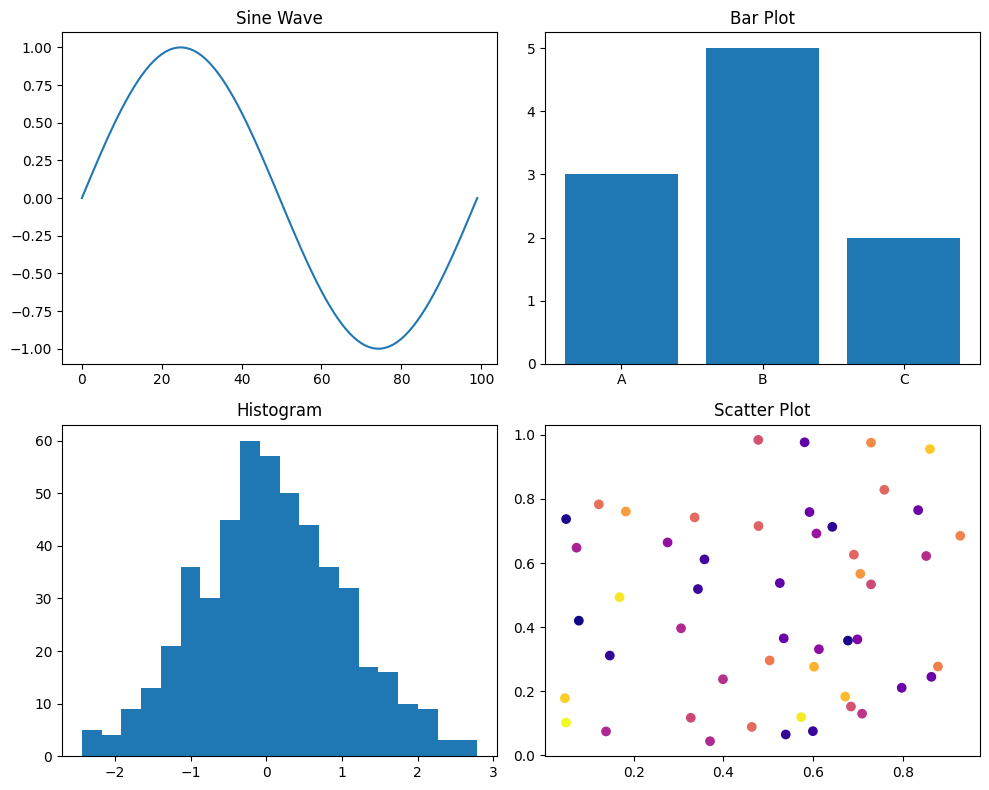
Creating Subplots
plt.subplots(nrows, ncols)to create grid of axes.- Adjust layouts with
figsize,tight_layout.
fig, axs = plt.subplots(2, 2, figsize=(10, 8))
axs[0, 0].plot(np.sin(np.linspace(0, 2*np.pi, 100)))
axs[0, 0].set_title('Sine Wave')

axs[0, 1].bar(['A', 'B', 'C'], [3, 5, 2])
axs[0, 1].set_title('Bar Plot')

axs[1, 0].hist(np.random.randn(500), bins=20)
axs[1, 0].set_title('Histogram')

axs[1, 1].scatter(np.random.rand(50), np.random.rand(50), c=np.random.rand(50), cmap='plasma')
axs[1, 1].set_title('Scatter Plot')

plt.tight_layout()
plt.show()
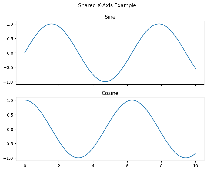
Shared Axes and Figure-Level Settings
- Share x or y axes across subplots.
- Add a main title with
fig.suptitle().
fig, axs = plt.subplots(2, 1, sharex=True, figsize=(8, 6))
x = np.linspace(0, 10, 100)
axs[0].plot(x, np.sin(x))
axs[0].set_title('Sine')
axs[1].plot(x, np.cos(x))
axs[1].set_title('Cosine')
fig.suptitle('Shared X-Axis Example')
plt.show()
Error Bars
- Use
plt.errorbar()to show uncertainties.
x = np.arange(5)
y = np.random.rand(5)
yerr = 0.1 + 0.2 * np.random.rand(5)
plt.errorbar(x, y, yerr=yerr, fmt='o-', capsize=5)
plt.title('Error Bars Example')
plt.xlabel('X')
plt.ylabel('Y')
plt.show()
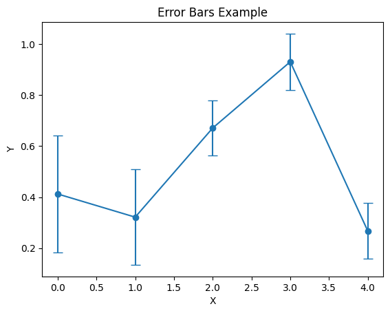
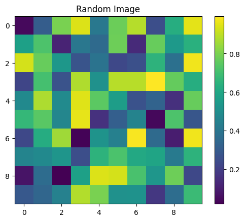
Image Plot
- Display 2D arrays as images with
plt.imshow().
img = np.random.rand(10, 10)
plt.imshow(img, interpolation='nearest')
plt.title('Random Image')
plt.colorbar()
plt.show()
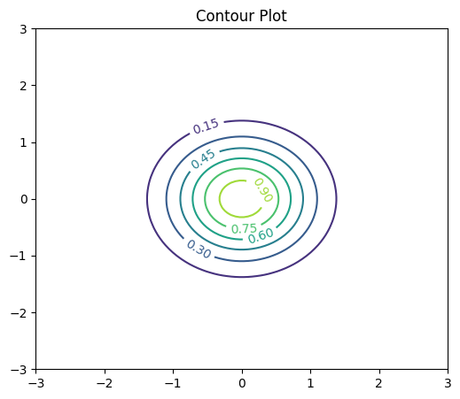
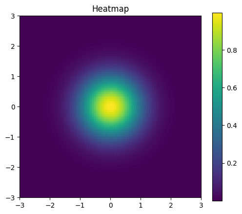
Advanced: Contour and Heatmap
- Use
plt.contour()andplt.imshow()for heatmaps.
x = np.linspace(-3, 3, 100)
y = np.linspace(-3, 3, 100)
X, Y = np.meshgrid(x, y)
Z = np.exp(-(X**2 + Y**2))

plt.figure(figsize=(6,5))
contours = plt.contour(X, Y, Z, levels=6)
plt.clabel(contours, inline=True)
plt.title('Contour Plot')
plt.show()

# Heatmap
plt.figure(figsize=(6,5))
plt.imshow(Z, origin='lower', extent=[-3,3,-3,3])
plt.title('Heatmap')
plt.colorbar()
plt.show()
Example project
This section guides you through generating, analyzing, and visualizing a synthetic dataset for classification.
import numpy as np
import matplotlib.pyplot as plt
from sklearn.datasets import make_classification
np.random.seed(5)
Generate Synthetic Data
- Use
make_classificationto create a dataset.
X, y = make_classification(
    n_samples=200,
    n_features=4,
    n_informative=2,
    n_redundant=0,
    n_clusters_per_class=1,
    flip_y=0.01,
    class_sep=1.5,
    random_state=5
)
print('Features shape:', X.shape)
print('Labels distribution:', np.bincount(y))
Features shape: (200, 4)
Labels distribution: [ 99 101]
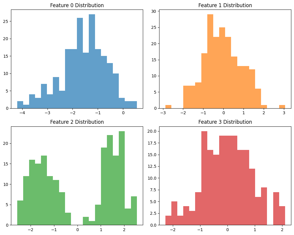
Explore Feature Distributions
- Plot histograms for each feature.
fig, axs = plt.subplots(2, 2, figsize=(10, 8))
for i in range(4):
    ax = axs.flat[i]
    ax.hist(X[:, i], bins=20, color='C{}'.format(i), alpha=0.7)
    ax.set_title(f'Feature {i} Distribution')
plt.tight_layout()
plt.show()
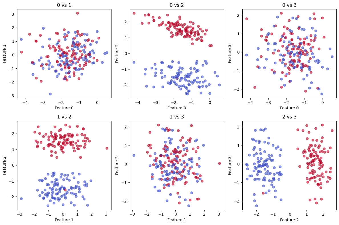
Pairwise Scatter Plots
- Visualize relationships between pairs of features.
fig, axs = plt.subplots(2, 3, figsize=(12, 8))
pairs = [(0, 1), (0, 2), (0, 3), (1, 2), (1, 3), (2, 3)]
for ax, (i, j) in zip(axs.flat, pairs):
    ax.scatter(X[:, i], X[:, j], c=y, cmap='coolwarm', alpha=0.6)
    ax.set_xlabel(f'Feature {i}')
    ax.set_ylabel(f'Feature {j}')
    ax.set_title(f'{i} vs {j}')
plt.tight_layout()
plt.show()
Compute Basic Statistics
- Calculate means and standard deviations per class.
classes = np.unique(y)
for cls in classes:
    cls_data = X[y == cls]
    print(f'Class {cls}: mean={cls_data.mean(axis=0)}, std={cls_data.std(axis=0)}')
Class 0: mean=[-1.51904518 -0.13961004 -1.51551924 -0.10388006], std=[0.94565383 0.92078405 0.53456453 0.88192832]
Class 1: mean=[-1.62540423  0.03701214  1.51590761  0.1083452 ], std=[0.85187348 0.96153734 0.53164293 0.91483422]
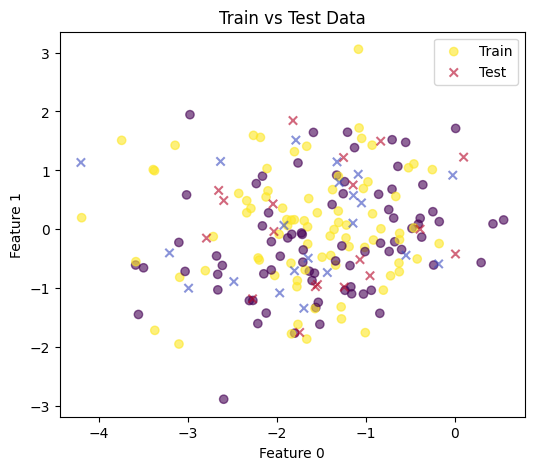
Train/Test Split & Visualization
- Split data using NumPy and plot class distributions.
indices = np.arange(len(y))
np.random.shuffle(indices)
split = int(0.8 * len(indices))
train_idx, test_idx = indices[:split], indices[split:]
X_train, X_test = X[train_idx], X[test_idx]
y_train, y_test = y[train_idx], y[test_idx]

# Visualize train vs test in feature 0 & 1
plt.figure(figsize=(6,5))
plt.scatter(X_train[:,0], X_train[:,1], c=y_train, cmap='viridis', label='Train', alpha=0.6)
plt.scatter(X_test[:,0], X_test[:,1], c=y_test, cmap='coolwarm', marker='x', label='Test', alpha=0.6)
plt.xlabel('Feature 0')
plt.ylabel('Feature 1')
plt.legend()
plt.title('Train vs Test Data')
plt.show()
Save Processed Data
- Optionally save arrays to disk for later use.
np.save('data/X_train.npy', X_train)
np.save('data/X_test.npy', X_test)
np.save('data/y_train.npy', y_train)
np.save('data/y_test.npy', y_test)
print('Saved .npy files in data directory.')
Saved .npy files in data directory.